The definition of a secondary color is that it can be mixed from two primary colors;
Red + Yellow = Orange Blue + Yellow = Green Red + Blue = Violet
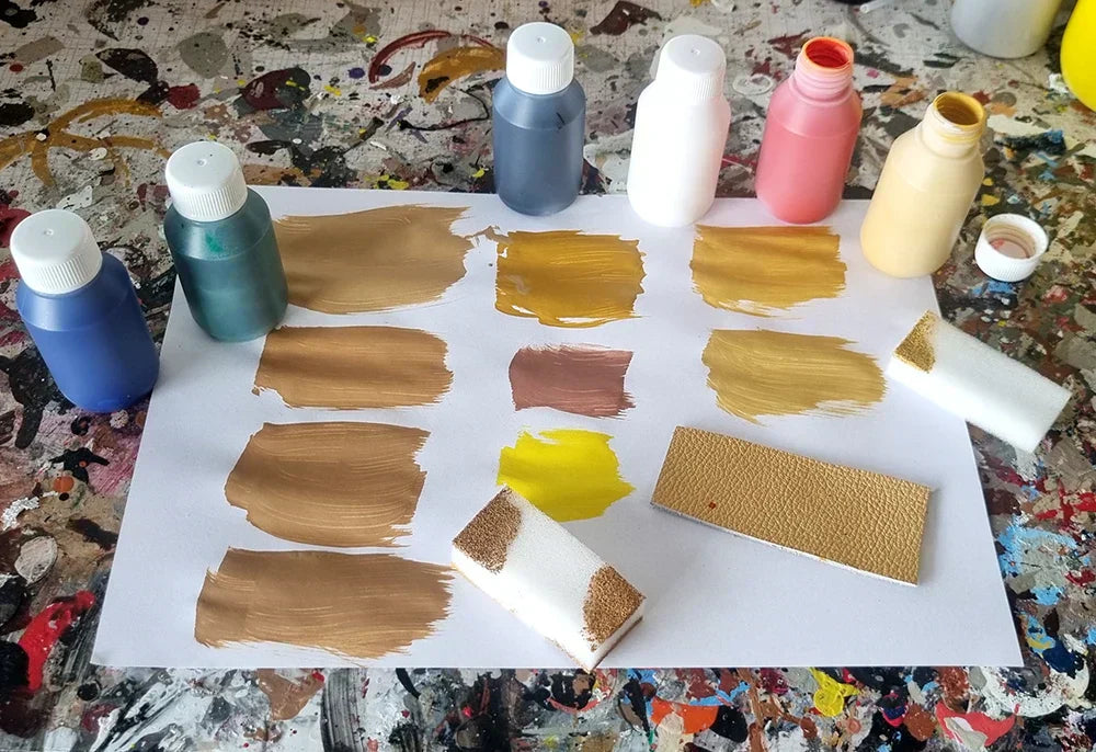
Yellow Oxide, Red Oxide and Umber (chocolate brown) are not true secondary colors; we have classified them as secondary shade colors because they cannot be mixed from primary colors alone. They are “dirty” or “muddy” colors designed to change both color and shade when making a color match.
LC and HC in brackets stand for “High Concentrate” and “Low Concentrate”. As you can see, the three primary colors and black have both HC and LC variants. You should use LC colors when mixing a shade to avoid the risk of getting too much of one color in the mixture. HC colors are used to mix base colors.
Black HC is used when dyeing black leather or when dyeing from another color to black. Black LC is used when mixing to a shade. Black HC is usually too strong for this purpose, it is very easy to get too much black in the mixture and once you get this it is difficult to go back.
Color theory
When doing a color match, you should consider three things; hue, saturation, and brightness (shade).
Hue – What color?
When we talk about hue, we often talk about the actual color, i.e. green, red, orange, etc. Think about e.g. cream; “Cream” cannot refer to hue. You have to see which primary and secondary colors can be distinguished in the cream color. Cream often has a red or yellow tint to it, but it can be difficult to distinguish which hue it is if the saturation is low.
Saturation – How colorful is it?
Color saturation refers to how colorful, or colourful, a color is. It works a bit like turning down the color on your computer screen so that it becomes completely black and white, which reduces the screen's color saturation (and vice versa, when you turn the color up again, you increase the color saturation, until the colors become far too garish).
So when you are doing a color match, you reduce the saturation by adding gray (black + white). This means that the color tone becomes diluted and less intense. By adding gray to a color, it retains the color tone (hue), but it becomes more faded or watered down. So for example, if your mixture looks too blue on a piece of blue leather, try adding a mix of black and white in equal proportions. As you get better at this, you can start adding more white or black if it is not only the saturation but also the brightness (shade) that needs to be corrected.
Shade, Brightness – How dark or light is the color?
Lightness usually refers to how dark or light a color is. Colors with high lightness are light (closer to white), while colors with low lightness are dark (closer to black). For example, bright yellow is a relatively bright color. However, its brightness can be further enhanced by adding white to make the color pale yellow. Blue is naturally dark, but can be made even less bright by adding black, which then becomes dark blue, or navy blue.
Brightness is mainly adjusted by adding white or black. However, any color added to a mixture also has an effect on brightness (for example, mixing navy blue into a light blue color will result in the light blue color becoming darker).
Perception – How we perceive color
When we talk about color perception, we are talking about how one color is perceived compared to another color. Ex….
When color matching, you have to take color perception into account. Before you get a perfect color match, your blend will look like a different color compared to the color of the leather you are trying to match. It may look too red, or too yellow, or too blue; one of the primary colors. It may also look too orange, or too green, or purple; one of the secondary colors.
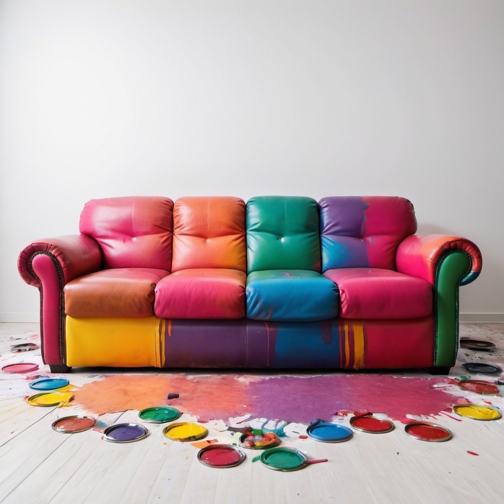
Purple example
What is demonstrated is that you can apply your matched color to one part of your sofa and it will match perfectly. The same color on another part of the sofa may not match as well, it may look like you have too much red (or some other color) even though you are using the same color mixture. This is because the sofa has been worn differently in different places, or perhaps has different types of leather on the top and back. For this reason, you should always match the color as close to the area that is to be dyed. If you are going to dye several areas, you should be prepared to correct the color as you go.
Metamerism
Metamerism is a phenomenon that occurs when a color changes depending on the light source. Color absorbs and reflects light from different light sources in different ways, which results in the color's hue appearing to change. This happens with all colored objects, from photographs to textiles. For example, the color of a sofa may look different in the evening under lamplight, compared to how it looks when daylight streams in through a window. There is no ready-made "fix" for this problem, but the best way to get around this problem is to try to match the color as closely as possible in the same conditions in which it will be used.
If you are going to dye the sofa in the example above, you can try to do this during the day, with the lights on, while letting in as much light as possible through the windows.
Complementary colors
Complementary colors are pairs of colors that are of “opposite” hue in the color spectrum. In theory, if you mix two complementary colors together, you get black or gray. In practice, this is difficult to achieve. With this in mind, let’s think back to the section on saturation. Adding a complementary color reduces the color saturation of the color that needs to be “muted,” and you get closer to a color match.
Complementary basic colors:
Red — Green Blue — Orange Yellow — Violet
Ivory
Think of ivory as a shade of light gray. It is a low saturation color. The hue is best adjusted with blue, magenta, red, orange, yellow, yellow oxide. When adjusting the hue of ivory, use only small amounts of the color you are adjusting with, as ivory is a low saturation color and it is easy to add too much.
Saturation is best adjusted with gray (black & white), which preserves the color tone while “diluting” it.
Brightness is adjusted with black and white.
To make it darker; add black in small amounts. Since ivory is a white shade, the more black you add, the more grayish the shade becomes. You may therefore need to adjust the color tone, this is done by adding the colors that the mix contains (see above)
To make it lighter; add white. White also makes the color paler, so even in this case the color tone may need to be adjusted, using the same colors as above.
Cream
Cream is actually a more colorful version of ivory, so the same rules apply to this color. Cream is also a color with low saturation, the difference is that it contains less black and white percentage-wise than ivory.
The hue is adjusted with magenta, blue, red, orange, yellow, yellow oxide and umber (chocolate). When adjusting the hue in cream, use only small amounts of the color you are adjusting with, as cream is a color with low saturation and it is easy to add too much.
Saturation is best adjusted with gray (black & white), which preserves the color tone while “diluting” it.
Brightness is adjusted with black and white.
To make it darker; add black in small amounts. Since cream is a color with low saturation, the more black you add, the more grayish the shade becomes. You may therefore need to adjust the color tone, this is done by adding the colors that the mix contains (see above)
To make it lighter; add white. White also makes the color paler, so even in this case the color tone may need to be adjusted, using the same colors as above.
Beige
Beige is a darker version of cream.
The hue is adjusted with red oxide, red, orange, yellow, yellow oxide, and umber (chocolate). Again, when adjusting the hue in beige, only use small amounts of the color you are adjusting with, as beige is a low-saturation color and it is easy to add too much.
Saturation is best adjusted with gray (black & white), which preserves the color tone while “diluting” it. Add umber (chocolate) if the color becomes too grayish.
Brightness is adjusted with black and white
To darken; add black in small amounts. Since beige is a color with low saturation, the more black you add, the more grayish the shade becomes. You can use umber instead of black to darken the color, then the saturation is better maintained.
To make it lighter; add white. Yellow can also make the color lighter, but changes the hue slightly.
Light & Medium Brown
Light and medium browns are basically a dark orange so they mostly have red and yellow in the mix.
The hue is adjusted primarily with red, red oxide, yellow and yellow oxide, with a little magenta and violet to bring in purple tones. The saturation is adjusted with gray (black and white), this ensures that the hue is maintained when diluting the color with red and yellow.
Brightness is adjusted primarily with black and white.
To darken the color, add black. Black with magenta or black with violet in equal amounts gives the brown a purple tint. Black with red oxide maintains the red tint.
To lighten the color, add yellow, red and/or orange. These lighten the color while maintaining the brown hue. Adding only yellow will “kill” the red hue in the brown. White can also be used to lighten the color, but can also cause the color to become “milky” if added too much.
Dark brown
Dark brown can either have a dark red/orange hue, or a hue more towards purple. Try to first assess what hue it is. To help, you can take Leather Prep on a cloth and wipe off some of the color, you will see on the cloth what hue the brown color has.
The color tone of dark brown with red/orange is adjusted primarily with red oxide, red, orange, yellow and yellow oxide. The color tone of dark brown with purple is adjusted with magenta, violet and yellow.
Saturation is adjusted with gray (black and white), which means that the color tone is maintained when diluted as above.
Brightness is adjusted with black and white.
To make it darker; add a large amount of black. Black with magenta or black with violet in equal amounts will retain the brown tone while making the color darker. Black and violet will produce a darker brown than black and magenta.
To make it lighter; add red and yellow in equal quantities. This will make the color lighter while maintaining the brown shade. Adding only yellow will “kill” the red hue. You can also add white to make it lighter, but white can also make the color a little “milky” if you add too much.
Dark blue
Dark blue is a bit more complicated than just black and blue. With that combination, it's common for the color to be way too blue. You have to make sure the saturation is balanced. Most dark blue shades have a little white in them to balance them out.
The color tone is adjusted largely with red, yellow, magenta, and blue. When adjusting the color tone in dark blue, start by adding a small amount and then assess how much more you need to add. You will probably find that it takes a lot for the adjustment to have an effect.
Saturation is adjusted with gray (black and white). Orange can also be used (blue's complementary color) to "kill" a possibly too high blue tone.
Brightness is adjusted primarily with black and white. Yellow can also be used.
To darken: add black. Violet can also be used to darken the color if it has a violet/purple hue.
To make it lighter: add white, but be careful, too much white makes the color “milky”. You can also use yellow, but here too caution is required, too much yellow gives a green tint. Should this occur, you can compensate with red (green’s complementary color)
Light blue
Light blue usually consists of a blue with white added, which gives a “clear light blue” shade. Often you need to add a bit of black to “kill” the brightness that occurs when you add white. So, light blue consists mainly of blue, white and black and has a low saturation.
The color tone is adjusted mainly with yellow, magenta, and blue.
Saturation is adjusted with gray (black and white). Orange can also be used (blue's complementary color) to "kill" a possibly too high blue tone.
Brightness is adjusted primarily with black and white. Yellow can also be used.
To darken: Add black. Violet can also be used to darken the color, if the light blue color has a purple/violet tint. Add only a little color at a time.
To make it lighter: Add white. Violet and blue can also be used together to get more brightness. Yellow can also be used, but yellow can cause a green tint if you add too much. This can be compensated for with red (the complementary color to green), but can cause the mixture to become a little grayish, and also make the color a little darker. More blue can then be added to counteract the gray effect, which in turn also leads to a darker mixture. Should this occur, white is used to regain a lighter mixture.
Green
The color tone is adjusted primarily with green, blue, yellow and orange. Red can also be used as needed, but if you use too much, it “kills” the green tone, making the color brownish with a green cast (red is the complementary color to green and together they make gray). Orange “kills” the blue tone in green and makes the color more olive green.
Saturation is adjusted primarily with black and white (gray).
Brightness is adjusted primarily with black and white. Yellow can also be used.
To make green darker; add black. Blue also makes it darker, but also changes the hue.
To make it lighter: add white. Yellow can also be used, but may change the hue.
Gray
Gray is not just black and white, gray always contains other colors. Think of gray as colors with very low saturation. Black and white alone will most of the time give a too blue tone.
The color tone is adjusted primarily with yellow, yellow oxide, violet, blue and umber (chocolate brown).
Saturation is adjusted with black and white, which can give a blue tint. This can be counteracted with orange.
Brightness is adjusted primarily with black and white.
To make gray darker: add black. You can also use violet or blue if you want the hue to change as well.
To lighten: add white. Yellow can also be used if it is dark grey, but tends to create a greenish tint. A drop of red can then compensate for this, but the red can also make the color darker.
Red/maroon
When red dries, the dry color tends to be very different from the wet color, so don't use the wet mixture in the mixing cup as a guide.
Color tone is adjusted primarily with red, orange, red oxide, magenta, violet, and yellow.
When adjusting the color tone in more reddish brown shades, be careful, as the slightest change can have a large effect on the color tone. However, magenta can be added in quite a large quantity, as it does not have as large an effect on the color tone.
Saturation is adjusted with gray (black and white). Be careful with black, as too much black makes the color brownish. Yellow works well with maroon shades, as maroon often contains violet and magenta. Yellow “kills” these and creates a more grayish color.
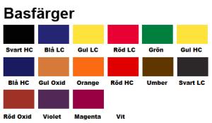
| Primary colors | Secondary colors | Secondary shadow color | Shadow color |
| Red (Lc) | Green | Yellow Oxide | Black (LC) |
| Red (HC) | Orange | Red Oxide | Black (HC) |
| Yellow (LC) | Violet | Umber (Chocolate) | White |
| Yellow (HC) | Magenta | ||
| Blue (LC) | |||
| Blue (HC) |